USA Pavilion at Expo Milano 2015
Fred Bernstein
18. May 2015
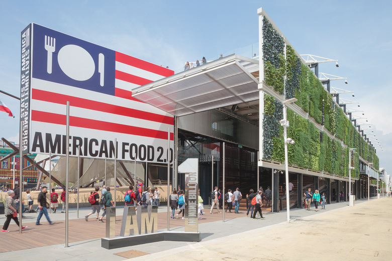
Photo: Tom Hennes
New York-based writer Fred Bernstein traveled to Milan for the opening of the Expo Milano 2015 – themed "Feeding the Planet, Energy for Life" – and sent us reviews of three pavilions: Germany, Switzerland, and the United States.
Here we present his take on the USA Pavilion, American Food 2.0, by NewYork-Architects member firm Biber Architects. See also his pieces on the German Pavilion, Field of Ideas, and the Swiss Pavilion, Confooderatio Helvetica.
Many Expo pavilions are boxy buildings with facades that camouflage their plainness. A prime example is Japan’s outpost, essentially a warehouse decorated with intricate woodwork at a few key points. At the other extreme, some pavilions aren’t buildings at all, but simply sculptures. The best example of this is the U.K. pavilion, a gossamer beehive made of aluminum connectors. There is no pavilion interior — just the sculpture and the meadow from which it is viewed.
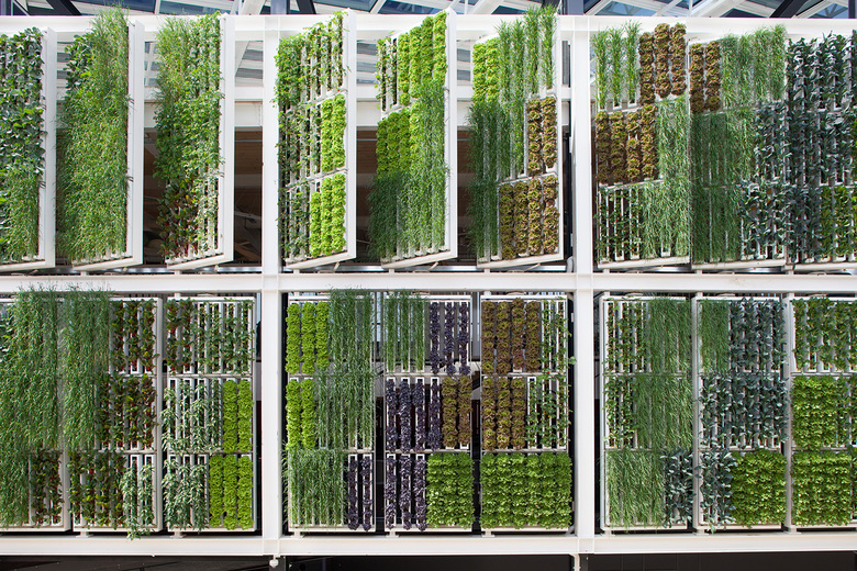
Photo: Tom Hennes
The USA Pavilion – American Food 2.0 – takes a hybrid approach. As designed by New York architect James Biber, it is largely an object — a boardwalk bracketed by a bold, inviting sign on one side and a huge green (that is, growing) wall on the other. The sign is a brightly backlit American flag, with a knife, fork and plate replacing the stars in the flag’s blue field. Based on the pavilion's logo by Michael Beirut of Pentagram, it delivers a clear message. So does the green wall, with 46 varieties of edibles growing on racks that swivel following the motion of the sun. A chart showing what is growing where is a model of clarity and a guide to anyone who wants to pick a leaf (the mustard greens are delicious, a pavilion staffer confided), though complicated rules prevent the pavilion from selling, or even giving away, what it produces.

Photo: Tom Hennes
The boardwalk itself, made from lumber recycled from the Coney Island boardwalk, is a piece of history that also offers lessons on culinary history. It leads to the back of the pavilion; from there it's a short walk to Food Truck Nation, a gathering of vehicles selling hamburgers, lobster rolls, and barbecue. The best place to eat what you buy? That would be the pavilion’s 4,000-square-foot roof deck, which Biber kept admirably spare, so people can enjoy the breezes and the views.

Photo: Tom Hennes
Is that all there is? In fact, a ground floor theater offers an orientation film, and then releases visitors into a series of rooms where videos lay out the American way of eating. (One video focuses on how various ethnic groups celebrate Thanksgiving.) Tom Hennes and his team at Thinc Design made sure the films were lively but short – the idea, Hennes says, is to offer real content while also moving people through quickly – an Expo necessity. Upstairs there are more “crops” growing from the ceiling (in cleverly lit and irrigated troughs) alongside small exhibitions on how the U.S. is working to feed a world population expected to reach 9 billion by 2050. The pavilion doesn’t try to do too much – indeed, it does just the right amount, which, given the history of U.S. pavilions, is high praise. Privately funded, it is a vast improvement on the last U.S. Expo pavilion, in Shanghai in 2010, which was architecturally bland and heavy on advertising. Here, references to sponsors are kept to a minimum, while U.S. ingenuity is front and center.

Photo: Tom Hennes

Photo: Tom Hennes

Photo: Tom Hennes
Fred Bernstein is a writer based in New York City.