WTC's New Logo
John Hill
15. August 2014
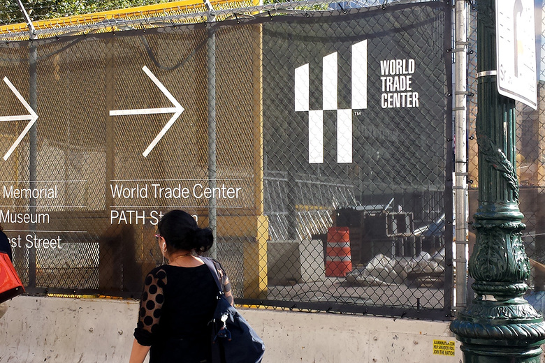
Photo: John Hill/World-Architects
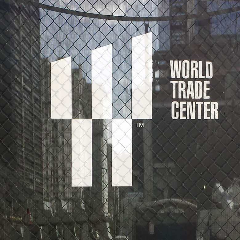
The Port Authority of New York & New Jersey has unveiled the new World Trade Center logo via the construction fences wrapping the 16-acre site.
At its most basic the logo – two rectangles at bottom alternating with three bars with angled tops above – is a blocky letter "W", but as discussed in an article in yesterday's New York Times the symbolism is rampant: the two spaces in the top recall the twin beams of the "Tribute in Light"; the two bars below refer to the memorial's pools; and the number of bars is the same as the five towers built (1WTC, 4WTC and 7WTC) and planned (2WTC and 3 WTC) for the site. Further, the sloped tops are reminiscent of the descending heights of the towers per Daniel Libeskind's master plan. Quoted in the Times article is James Biber of Biber Architects, who opines that "it’s so anonymous that it almost evaporates...maybe this is the last step in the rebranding of something that has disappeared."
The logo is designed by Landor Associates, a branding company that is responsible for the identity of large corporations like FedEx, but had already worked at the WTC site, on the identity and design for the 9/11 Memorial & Museum.